Thursday, November 19, 2009

demo relief print made from Styrofoam - jigsaw block technique


Take out
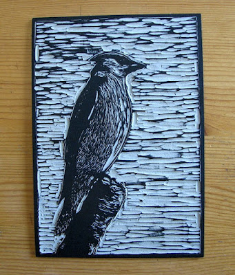
styrofoam jigsaw relief print on black paper


I will be starting a project on Monday working with about 20 elementary school students (range of grade levels from four through eight). They will be creating individual relief based prints from the surface of a product called scratchfoam. The students will be learning a technique called jigsaw block. They first draw an image into the surface of the foam using ballpoint pen. Then waterbased ink is rolled onto the print surface using a rubber brayer and printed using a hand burnishing application onto a piece of paper that is set over top.

The foam is first bonded to a thin piece of bristol board using a high tack spray adhesive. The bristol board has a thin layer of water based varathane rolled on the bottom side to help waterproof it and to counter act the tension of the two materials brought together. This prevents it from curling when it is cut apart or when ink is applied to the surface. This sandwich thickness is still pretty easy to cut using scissors.

The next step is to dissect the block which will allow it to be printing using a jigsaw technique.
I carefully cut the block apart using scissors and xacto blades. The trick was to follow lines already drawn into the foam and use these as a cutting guide .


I devised a registration board system so that a 9 x 12 inch piece of scratchfoam was reduced to a 7 x 10 inch block. This left 1 inch strips of scratchfoam which were set along the edge of a 9 x 12 foamcore registration board and held in place with masking tape. The inked pieces were reassembled back into this frame. Each of the 7 individual segments had a colour of ink rolled on and were then reassembled A 9 x 12 piece of black paper was placed over the block and held in place with push pins at top. The placement of the block contained within the one inch strips along the perimeter helped to center the block on the paper and left a one inch border around the image on the paper.

I found that Speedball ink has a tendency to dry quickly (even with retarder medium added) so had apply a spray of very fine water mist to reactivate it just before the paper was set over top and hand burnished.I usually spray about 15 - 20 inches above the block and let the mist settle gently and evenly on the surface. Unfortunately a little bit more water collected and caused a little uneveness in the light blue section under the crow and to the left side of the trash can. Anyhow those that work with Speedball might understand some of the challenges it presents.

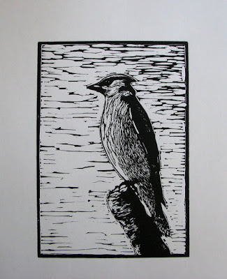
I chose black paper as it provides the dark contrast to define the line in a positive image. If this was printed onto white paper then you would get a neg. image.The students should have some fun with this testing their skills in composition, colour application and exploration of shape, line, texture to name but a few key learning factors.

Another thing I have learned is that some of the Speedball inks such as yellow, red and blue do not print as opaque on a black background so by adding just a hint of white ink will help to increase the opacity. But in some cases the transparency factor can be used for effect (for example a pure yellow was printed on to the black paper in the grass section at the bottom of this image and produced a tint of green).

If I were to do an edition of prints from the foam block for my own collection (which I may still) would most likely would use an oil based ink and print these on a better quality of printmaking paper that is available in black such as Stonehenge, Somerset or Canson paper.

Saturday, November 14, 2009

A combination of relief and intaglio


This new print was born from the combination of two techniques and used one linoleum block. It is a study of the patterns found on the surface of water (in a bit of an abstract presentation). Basically what I did was wipe and force a water soluble oil ink (prussian blue) into the cut recesses of the block. The flat surface relief had a layer of light cerulean blue linseed oil ink rolled onto the surface with a brayer.

I soaked a piece of heavier white cotton rag paper and then blotted it between an old cotton towel. Setting my top roller for moderate pressure on the etching press I put felt blankets and newsprint overtop of the print paper (which was set on top of the block) and ran it under the roller. This pushed the damp paper down into the recessed areas and also picked up the ink from the surface. Some of the deepest areas of cutting did not get ink into them so they printed as slivers of white which add to the play of light on the surface of the water.

Tuesday, November 10, 2009

adventurous photopolymer prints


Superior - A reflection
photopolymer gravure/hand colouring
2009
image size 12.7 x 17.8 cm, paper 25.5 x 30.5 cm
variable edition of 50


The Stream of Consciousness
photopolymer gravure / hand colouring
2009
Image size 12.7 x 17.8 cm, paper 25.5 x 30.5 cm
Variable edition of 50


Some recent explorations with interesting results created by crossing media.
Both prints are both derived from photos I have taken. They have been interpreted as prints by exposing the positives made from the photos onto photopolymer plates and printed as gravure impressions in paper using an etching press .

The application of watercolour into both helps to expand each image from the state of a single colour impression and makes each come to life in it's own unique way.
Superior - A reflection remains fairly close to the original photo in it's colour values. I was very fortunate a couple of years back to have come across a pool of water on the shore of Lake Superior which I thought actually resembled this great lake in terms of it's shape (when one looks on a globe or in an atlas). The reflection of the fir tree and branches plus the sky and the few loose leaves floating on the surface add to the overall impact.
This same image started off as a photopolymer gravure study but in a much smaller square format last year. It was created then as a contribution I made to a miniature print exhibiton sponsered by Graphik Vaerstad Print studio in Naestved Denmark. I found the imagery rather fitting for the fresh water connection and so have scaled up and approached it with a slightly different colour palette this time around.
.
The Stream of Consciousness approaches the presentation of image from a slightly more abstract perspective. I have applied an interferance copper wash over the print (blocked out the white areas using liquid frisket) and then more washes of cerulean and indigo, serpentine green and a hint of cadmium orange on top of each other. The frisket was carefully removed with a rubber cement eraser to reveal the white of the paper. The metallic effect of the interferance wash is evident when the print is viewed in certain light and from particular angles. It reminds me of some of those beautiful glazing effects sometimes one finds on dark colour pottery.

Both of the studies are part of a series of work that explore fresh water and it's relationship to me. It is my intention that they will be on display along with 22 other studies I have produced for a trio exhibtion that focuses on this theme in a display of printed images on paper taking place at Gallery Stratford in January 2010. The show is titled Watermark.

I apologize for the copyright text emblazened across the bottom of each image. Unfortunately I have not yet been able to find a right click disable option in the blog applications so in order to protect unauthorized duplication of my images I must resort to this for the time being.

Tuesday, October 20, 2009

Collagraph - collage plate print


I am currently working a small series of collagraph prints which are a combination of intaglio and relief printing surfaces.

The untitled work pictured above represents streams of water, one passing through a channel in rock and the other flowing over a ledge.

I may apply a bit of hand tinting to one of the proofs to see how the image might be affected. Another option is to dab small areas of colour ink to the plate using an a la poupée technique where ink is dabbed on with tiny bundles of cloth and selectively wiped. Poupée comes from the french word for dollies or dauber.

The base plate is a piece of tagboard to which I have applied glue and affixed elements such as thin pieces of scratchfoam (styrofoam product), living organic materials such as grasses and conifer needles, more cardboard and the odd scrap of fabric. Then acrylic based modeling paste was added using a brush and worked with the brush tip to create interesting textures. The rule of thumb is that anything with a low relief (and will not damage your roller) can be attached to the plate which is then sealed with varnish.

Here I have worked into the styrofoam with a needle and also by pressing coarse grit sandpaper and burnishing it to leave impression marks in the styrofoam surface to replicate the pocky texture found in igneous rock that is commonly found in the region where I reside.


Ink is applied and wiped into the lower recessed areas and also applied using a roller to the surface relief areas.

In this particular image I have applied one colour of oil based ink that coated the entire plate and then I carefully wiped away off surfaces using tarlatan (starched cheesecloth), tissue and old phone book pages.

I soaked a piece of 250 gsm rag printmaking paper for about 20 min. in lukewarm water then blotted it between pieces of newsprint and tissue until it was ever so slighty damp to the touch. The plate was set onto my etching press bed, the paper placed over top and then two layers of wool felts over that. It was passed under the rollers using a fairly tight squeeze (as the plate is a bit higher it doesn't require the same amount of pressure as that of metal plate etching).

Liking how the ink deposits into the recesses and with selective wiping creates a look similar to an etching with aquatint.


Friday, October 16, 2009

Water pool - along Superior (Solar plate print)

Water Pool - along Superior
solar plate print with hand colouring
Image size 5 x 7 in. (12 x 18 cm)
paper size 8 x 10 in. (20 x 25 cm)
variable edition of 24


I used one of my photos as reference to draw a rough which led to the creation of the print.


Pictured above is the second stage on frosted drafting film from original sketch done in pen and ink and fine point marker with washes applied using thinned down india ink. The first rough sketch in pencil on paper was placed underneath the drafting film and was used as a guide to apply the washes first. Once these were dry I then added in the linework and dots with pen and ink. This was then scanned at 600 d.p.i. on my scanner and printed in grayscale onto an inkjet transparency.
Exposed the transparency onto a 5 x 7 inch solar plate using the double exposure method, first stage being the aquatint screen exposure followed by the grayscale positive. The aquatint screen acts like a halftone to pick up the lighter elements in gray from the image so as not to get a high contrast effect.

Printed on Canson Edition 250 gsm off white with Graphic Chemical Bone black ink. Colour was added using washes of watercolour.

Saturday, October 10, 2009

Elementary School Art - Collagraph prints from Nature

untitled
collagraph print
water based ink on rag paper
plate size 20 x 25 cm (8 x 10 inches)


I recently was contacted by a Gr. 5 elementary school teacher in Thunder Bay expressing interest in having me come and undertake a printmaking based project with his class.

This is for a program called Artists in the Fifth. This program has been up and running for the past few years where grade five students and their teachers in regional schools choose to bring in actual working artists (visual, musicians, dance and movement, writers,etc..) to the classroom and the children work directly with us on unique and exciting projects designed around particular themes. The results of these projects are then presented to the local community in a one day showcase called An Arts Fiesta which takes place every Feb. at our local community auditorium. The participating schools with the students and teachers are in attendance as are the artists who have come into their classes. In addition the public and local media are invited to come and participate.

The visual art creations are displayed on panels or hung on the walls while music, spoken word and movement pieces are performed on stage.
The theme this year for the program is Design by Nature.

The class I will be working with decided they would like to explore collagraph printmaking and so I decided to create an example print that illustrates what can be achieved.

For this particular study I incorporated natural materials found in nature such as leaves, blades of grass, conifer needles. These were adhered to a thin paper plate with PVC glue. I also added in some background texture to the plate by working a thin layer of acrylic gel medium in with a paint brush. When everything was dry and the gel had hardened I coated both sides of the plate with acrylic latex house paint. This helps to seal and waterproof and keep the tension equal on both sides of the plate.


I then applied waterbase printing ink to the plate surface by painting it on with a brush, dabbing it into recesses with sponge foam brush or small bundles of material. The ink was then wiped with rags or worked with my fingers until I felt it had reached a point where it was ready to print onto paper.
As the waterbase ink was starting to dry I applied a fine mist of water spray to the plate surface and also to the one side of the paper which was then set over top of the plate. Both plate and paper were set on the bed of an etching press and a rubber blanket was placed over top of the plate/paper. I passed the works under the roller of the press (it was set for a bit of a squeeze) but not as much pressure as one would require to print a etched thin metal plate.

Notice how the combination of pressure and ink picks up the fine structures found in each object especially the leaves and the cedar needles. This is a direct example of designs created by Nature as they are observed in the actual materials used. I have taken the natural components and arranged them in such a way to teach the students about composition, colour, texture and
the like.

Thursday, October 1, 2009

Applying colour into a solar plate print

Lichen Formation
solar plate print with hand colour
edition size of 40
2009


I finally got around to applying a bit of colour to this work which was originally featured back in my Feb. postings (without any colour application). This was derived from a photo I took and that was converted to a positive transparency and exposed onto a solar plate. Using my homemade UV exposure unit I used a two step process where the plate was first pre-exposed for about 3 minutes to a fine dot aquatint screen followed by an equal length exposure of the grayscale positive. Both the screen and the transparency positive were sandwiched tightly under a 3 mm (1/8 inch) thick piece of clear glass on top of the plate which was set on a dense piece of foam and wooden baseboard using plastic shop spring clamps.
The plate was developed using tepid water in a photo developing tray and using gentle scrubbing of the polymer surface with a soft bristle tooth brush.

It was then blotted quickly with newsprint and dried with warm air from a portable hand held hair dryer. The polymer was then set under the unit for about 10 min for a post exposure to cure (or harden) the surface coating.

I then inked the plate as you would a traditional etching and using Graphic Chemical Intense black oil base ink printed it into a slightly damp piece of Somerset Velvet 250 gsm off white rag paper.

The print was adhered onto a piece of board using gum backed butchers tape. I had set some aside into a storage bin in the studio and a few days back rediscovered those so decided to apply hand tint into the piece by first wetting the areas to receive colour and then allowing watercolour wash to bleed into the white areas of the paper to apply the colour tint effect.

Friday, September 18, 2009

late summer journey along Lake Superior


I had a couple of good friends visiting from out of town so my partner and I decided to take some time off and treat them to a few excursions to wilderness places around the region. Needless to say with the entertaining did not accomplish too much in the studio the past few weeks however the time has come to return to my work.

Here are a few photo highlights taken during these journeys.


Sunday, August 23, 2009

small hand coloured etchings - regional studies


This is another recent work which was printed from a solar plate. The image features sailboats in Thunder Bay harbour with the famous Sleeping Giant geographical outcrop visible in the distance. I created the clouds by first blocking out the paper with masking frisket and applying washes of watercolour. Each individual print has a unique sky and cloud formation.


Title: Summer
Medium: solar plate with hand colour (variable edition)
Plate size: 8 x 8 cm (3 x 3 inches)
Paper size: 15 x 15 cm ( 6 x 6 in)
Edition size: 50


Sunday, July 12, 2009

2nd relief engraving - The Wild Rose (a botanical print)


This botanical study of a wild rose blossom is a working proof printed from a small 1.5 x 2.75 inch resingrave block. I was using it as an exercise to practice cutting with a variety of engraving tools. I also received a small sample tube of Gamblin oil relief printing ink from McClain's and so had the opportunity to try it out with the block.
The first image is simple black ink proof printed on white paper. Below that is a hand tinted version that incorporates watercolour.

The image began as a drawing made onto an black india ink coated resingrave block surface with a fine point silver gel marker. Then using a variety of engraving tools I cut away the silver lines (but some non-drawn line cuts were made spur of the moment on the block).

A tip I learned from wood engraver/author George Walker's book The Woodcut Artist's handbook is to brush some chalk or white talcum powder into the cut lines as this will help the relief to become more visible while working on the dark block.
I have printed several proofs so far on a variety of different papers that include Gampi, Kozo, Somerset velvet rag and Arches cover buff.

The block was printed onto the papers using a cardboard tympan set over top and passed under the top roller of my small table top etching press that was adjusted to print using a slight pressure.


Monday, June 29, 2009

final version of an earlier work


Shore
relief block with hand colour
edition size: 40
image size: 2.75 x 3.5 in.


I printed the original key block (cut from the Easy to Cut material) using black ink onto a piece of waterproof drafting film. While the ink was still wet I then carefully by eye aligned it onto an equal size piece of battleship linoleum. Then the image was transferred to the lino surface using hand burnishing with the back of a wooden spoon (rubbing the backside of the drafting film in a firm yet gentle circular motion.)

Once the ink had dried on the surface of the lino the black line image was used as a cutting guide (the transfer from the drafting film allowed the design to be positioned on the new block in the same directional layout as the original easy to cut block). I decided to incorporate a thin line border around the design for this version.
Another difference this time is that the print is derived from a single block. Colour has been added into the print with watercolour painted in by hand.

19 of the edition are slated as exchange prints with fellow printmakers through the WetCanvas printmaking forum.

Saturday, June 20, 2009

Wilderness - new series of works on paper

Late Afternoon - Algoma woods
drypoint intaglio from an acrylic plate
edition of 10
2009


A study from a new series of 24 prints I have titled Wilderness. Each image in this series is a depiction of some aspect of the untouched beauty found in the region of Canada I call home and have explored at different stages during my life to date. Some of the work focuses on landscapes, others portray flora and fauna in their natural habitats. I also explore different seasons and times of day.
Late Afternoon - Algoma woods is a single colour (monochromatic) drypoint that was created by drawing into an acrylic plate using a sharp steel needle. Ink was wiped into the recessed lines and the plate was printed into dampened rag paper under extreme high pressure forcing the paper fibers into the recessed lines to pick up ink while it was passed through the rollers of my hand turned etching press.
I will be posting more studies from the series as they are photographed.

Tuesday, June 9, 2009

Elementary School Art - Teaching Relief Printmaking in the schools

I recently completed a 25 hour placement in a regional school where the students learned to make multiple colour relief landscape and other prints. This was my first solo venture as an arts educator into the educational system through the Artist in Education program which is offered to schools by the Ontario Arts Council. I have been active through another program here in Thunder Bay called Community Arts and Heritage Education Project (CAHEP) for the past three years running where projects I've offered have been selected by teachers/schools. Usually the time committment is much shorter for these in comparison to the OAC projects.


For this project the students learned relief printmaking from scratch and were given the opportunity to create a series of square format landscape colour prints.

Below are a couple of photos showing a few of the finished prints displayed in a horizontal panoramic type format.


To view a PDF file that gives the project overview and also includes a photo montage of particular stages of this project click on the following link:
the pdf file can be opened by clicking on the blue underlined text link which is located underneath the photos on the page.

Monday, June 1, 2009

Resingrave - a new type of engraving surface for relief printing


The Marsh
relief engraving
block size 3 x 6.5 cm (about 1.75 x 2.5 inches)
Daniel Smith Black relief ink printed onto Somerset 250 gsm rag white


Above is a photo and close up of the engraved surface from my first print created from the surface of a material called Resingrave. This study is from a very small block and required viewing it through the magnifying lens of a swing arm daylight lamp while cutting the surface.
Here is a link to McClain's in Portland, Oregon. They are a relief printmaking supplier/retailer who sell the Resingrave product. They also have a wonderful online gallery of works submitted by many known and unknown artists.
http://www.imcclains.com/catalog/blocks/resingrave.html

Last year I purchased a starter set of six wood engraving tools from McClains (manufactured by Edward Lyons Co.) and several blocks of a product called Resingrave. This hard resin epoxy material is bonded in a thin layer onto a thicker layer below of MDF substrate base and is a synthetic version of hardwood. Since traditional boxwood is becoming an endangered species this was invented by a printmaker from California as a substitute. The blocks that I purchased are a new formula that has more resistance to chipping, something that unfortunately was a problem with the original formula and turned a few people off of using it. In addition to the resingrave I purchased a small leather cushion filled with sand to set the block on while cutting (this makes it easier to turn the block when you are cutting round lines). First I coated the surface of the resingrave with black india ink and when it was dry then I drew on top using a Sakura gelly roll white pen. When the surface area was cut away (using the white ink lines as my cutting guide) the contrast off white of the resin epoxy material was exposed, so this more or less shows you a bit of what your image will appear when it is printed in black and white (but in reverse).
I was able to locate a cabinet maker locally who possessed a fine tooth carbide blade and a table saw, he was able to cut down the larger blocks into smaller size pieces . I used a small tabletop etching press to print the block. I first created a set of runners made of compressed particle wood material (MDF) with a thin layer of easy to cut vinyl material glued on top. I wanted to make these the exact height as the resingrave blocks as they would be positioned under the roller to keep it level. Then I would set a 1/8 inch sheet of millboard over top of the damp rag paper which was positioned over top of the inked block and passed the works under the top roller with just enough of a slight pressure to allow a good transfer of ink onto the paper. In the photo you will notice that some of the uninked cut areas that define the sky were embossed into the paper creating a very interesting subtle 3D effect that is quite noticable when light hits it at the right angle. This is a technique called blind embossing.
I have also experimented with other papers including Masa oriental paper and Zerkall paper that is made in Germany. These are not soaked and will not reveal the wonderful embossing effect to the degree that a heavier damp paper will.

Below is a photo that shows the block surface with ink rolled on the flat surface and the resulting reverse image print.


The summer months are going to be spent with more exploration of this medium.

Thursday, April 30, 2009

landscape - demonstration print for teaching relief block


Lake Superior shoreline study
five colour working proof print
speedball w/s ink on subi block paper
printed using hand burnishing


I am starting a classroom based printmaking project next week in a elementary school about an hour east of Thunder Bay. The students will learn to create several multiple colour relief block studies based on landscapes of the region.
The print pictured above is a piece that was created specially for this project. It is a study of rocky shore along Lake Superior. Will be using it as an example to show how to print a landscape using a combination of different types of relief surfaces (softoleum and scratchfoam in this case). It also illustrates how one can layer colours from different relief block surfaces to build an image.

Fig. 1 shows the initial pencil sketch which was scaled down to fit the softoleum block which became my master or "key" block.
fig. 1

fig. 2
Figure 2 shows the colour layout that I did in marker. This will serve as my guide for mixing my ink colours when the blocks are carved and ready for printing.
In figure 3 I have cut away the surface of a piece of softoleum with linocut knives. First I coated the surface using black permanent marker and then using my sketch as a reference I redrew the image on the black surface using a silver gel pen. The light silver colour lines and shaded areas were cut away to leave the surface areas that would determine the relief when it is printed using black ink. This material cuts very easily so I had to just lightly dig in with the tool tips to remove it. I wanted to create a bit of depth from the lower section so I went over that later with a larger U gouge blade to remove more of the rubber like material.


fig. 3

Fig. 4 is an example of a simple registration system for printing. One important observation I made is for exact registration the block height and horizontal level that the paper rests on the block should be about the same distance. Any variance in height can cause a slight misregistration when printing. To allow my paper to lay horizontally level on the 3/8 inch thick softoleum keyblock I found that a strip of 1/4 inch foamboard with a strip of matboard on top of this created a header bar to which I could pin my paper at the top of the registration board. What I did was tape this header bar to the top edge of a baseboard (cardboard). I also cut the baseboard to be the same size as that of the paper which is 23 x 30.5 cm (9 x 12 inches.) The paper was secured by applying four evenly spaced thumb tacks pushed through the paper into the foam strip underneath.


fig. 4

The blocks were secured in place for printing on the registration board by first centering the key block then taping strips of matboard around the sides and along the bottom edge. The additional blocks which were the same size as the key block fit into this U shaped brace. The paper was placed over top of the inked block, hand burnished and then carefully folded back and held down wiith one hand while I removed the block. Then you can remove the tacks and hang the print to dry until ready to print the next colour in which you match up the pin holes in the paper with the foam strip (the thumb tacks will fall into place easily when you find them.
A tip is to make a black dot by using a marker point around the pin hole on the foam strip. These dots can usually be seen through the paper. This helps to relocate the depressions in the foam where the tack points will depress when reattaching the paper to the board.

Fig. 5 illustrates several colours on the paper printed from the styrofoam (scratchfoam) sheets.
Sheets of scratchfoam were glued onto both sides of a piece of foamboard. First of all it made the block the same height as the softoleum block. The second benefit is that it also allows both sides of the block to be used.


fig. 5

Thursday, April 23, 2009

Pukaskwa/Driftwood Beach - the finished print


Pukaskwa/driftwood beach
colour relief blockprint
2009

Finally completed this study which started off as a single colour black and white print.
I wasn't satisfied with the hand colour application so made a decision to cut additional blocks and add in a majority of colour with ink. However a little hand tinting was still used in the driftwood and background foliage. It is hard to tell from the photo but the variations of the light washes of Payne's gray would have been too much work to try and capture printing off another block surface. It also simplified things to paint in the little area of green for the foliage as it is small and subtle. The ink printed a little darker than what was shown in the computer visualization, however the darker hues appear to add more drama which I don't mind at all.
The granular texture in the sand was created from the surface of a piece of wondercut linoleum which produced a grainy effect . This was intentional as the hint of texture added more interest into the image.
The two different colours of blue were printed from one block, the water section was cut away as a jigsaw insert, was inked seperately and then set back into place and printed along with the blue sky with one pass of the press roller.
In the process of printing an edition of 50.

Wednesday, April 15, 2009

Pukaskwa National Park - driftwood beach


Continuing on with the blockprint series this is my most recent work. The above image is the first proof taken from the cut block which was printed in black ink onto Subi paper.
It is a landscape study featuring driftwood and washed up weather beaten logs that litter one of the many pristine white sand beaches located at Pukaskwa National Park on Lake Superior.
I plan to apply watercolour to a few and then possibly a series of prints created with the addition of colour blocks. 


The block was glued down onto a masonite panel substrate and then cut with a variety of linocut tools plus one or two spitsticker wood engraving tools for fine detailing.
I refined the image a bit more with some additional cutting of the block. There is now better definition of the background foliage and also the water to the left side of the print.
The image developed by referring to a couple of digital photos that were taken last fall when we visited the park. Once again I blackened the surface of a piece of linoleum (13 x 18 cm or 5 x 7 in.), however this time used a golden cut variety instead of battleship gray. This allowed me to see the block as it would print (only in reverse) as the lighter areas of the block material would appear as white on the paper.

Below is the freehand sketch on the linoleum surface made with white Sakura gel pen.
The attachment below that is of the block during the cutting stage.


Friday, April 10, 2009

Wolf lake relief block with watercolour


Wolf Lake - North View


Here is my first attempt at the application of watercolour into the image. Since the paper is a slightly textured 250 gsm rag suited for printmaking it also accepts the washes of the watercolour very nicely. The print was secured to a birch board by fastening with butchers tape around the edges to keep it from developing a permament buckle from the wash application.

Tuesday, April 7, 2009

Wolf lake - working proof


I have cut the block and decided to print a test proof. The block had black oil relief printing ink rolled on and was printed onto Subi white blockprinting paper. I spotted a couple of areas that will be refined a little more with cutting tools before the final print is made. My intention is to print this in a single colour (black) on ph neutral paper like Coventry rag or Somerset. Then watercolour will be painted into the image.

The block size is 13 x 18 cm (5 x & inches).

Below is an example of a print I did in 2007 titled Lake Marie Louise which incorporates this hand colouring technique into a single colour of ink printed on to watercolour paper.


Sunday, April 5, 2009

Block relief landscape - Wolf Lake, Northwestern Ontario


Here is the start of a new study. It is a depiction of a place called Wolf Lake, which is found in a remote wilderness area about an hour and a half east of Thunder Bay (a bit of drive in off the trans Canada highway) near the small town of Dorion. It is accessible by a bumpy surface gravel bush road which follows the western shore of the lake for a good part. I had the opportunity to visit Wolf lake in August 2008 and from the many photos taken that day this sketch was derived. The shoreline on the eastern side of the lake is defined by escartment and cliff face giving one spectacular views from both above and below.


The area is part of the Ouimet Canyon geological system. The Wolf River flows out of the lower end of the lake and southward until it empties into Lake Superior.


The freehand sketch was made using Sakura gelly roll white and silver ink permanent marker onto a piece of battleship linoleum which has been darkened with a Sharpie Chisel point permanent black marker. The next stage is to mount the lino onto an equal size piece of masonite board to keep it flat for the cutting and printing stages.

Wednesday, April 1, 2009

Cedar waxwing block print - mid stage developments

Continuing with the new block print I have now created a second block from which the colour ink that defines the background sky will be printed. However first I decided to mount the linoleum keyblock onto an equal size piece of masonite board to help keep it flat and also allow a better application of ink with the roller. I simply glued the two pieces together and set a weight on top until the adhesive had completely dried.

For the background sky block I am using a piece of easy to cut vinyl mounted on top of masonite. This keeps it the same height as the keyblock and will not create an offset on the print paper due to height variance. I traced an outline of the bird and stump shape with carbon paper onto the easy to cut vinyl and then cut it away with a U gouge knife blade. I also trimmed back the material around the perimeter of the block surface (about .3 cm or 1/8 inch). When I overprint my opaque black keyblock the black line will cover over this gap.


Easy to cut vinyl mounted on masonite board and inked using a roll blend from dark to light


My Japanese soft rubber brayer hanging on hook with blend roll of ink applied to the (24 cm or 9.5 inch long) cylinder awaiting application on the block surface


The background sky block is printed first (ink was applied using a blend roll where dark and light blue are blended together and applied by roller onto the block). Notice the white open areas that define the shape of the bird and the tree stump. These will remain white underneath the black key block outline and will allow me to apply watercolour to add the colouring in the bird.


The block ready to be printed using the press roller. I will set the paper over top and secure that usingthe three hole punch (the blue plastic and metal on the left hand side. A thin paper board is set over top of the print paper and it is passed under the press roller transferring the ink to the paper.


I have decided that the variation in colours in the bird itself would be a bit tricky to cut blocks to print due to the small area of colour needed, therefore I will apply watercolour into this area by hand. I have cut back all the line (aside from the perimeter border) on the key block to allow the bird to stand out. The colour blend in the background will act as the area of interest around the bird but not take away from the focus.


Next post will feature the key block printed over top of the blue and one of the first hand coloured finished prints.

Saturday, March 28, 2009

early stages - new block relief print


In continuing with a bird theme I decided to do a study from a photo I took last year of a cedar waxwing perched on top of a dead birch tree stump.


I put the photo in front of me and then by eye sketched freehand right onto a piece of gray battleship linoleum that was first coated in black ink from a broad tip waterproof Sharpie marker. The sketch was made on the black using a silver ink extra fine point gel marker. It dries quickly and won't smudge when the lines are dry. The contrast is great and allows me to use the lighter line as my cutting guide.


For this study my plan is to leave a thin line in the keyblock that will be around the print. I also want to add colour so may cut and print several more blocks or I may just apply hand colouring, haven't really decided yet.


I cut away at the block with a variety of gouge shapes but mostly a large U shape gouge for the broad areas that will define the sky. I then carefully added fine line detail in the bird using a wood engraving spitsticker tool.


Then it was time to roll ink across and take a test proof to determine how much more I still need to cut away. It is hard to tell in the background sky what lines will show up until ink is rolled across the surface. Here is the resulting proof produced on bond paper with w/s ink.

I think the sky is a little busy for my taste so will remove more line (but leave a hint here and there just to add a little interest.) Adding colour into the print will also give it a whole new dimension so may do a marker or watercolour rough mockup first from which I can decide how things will work.


Wednesday, March 25, 2009

A small photo based etching with hand colouring


The print above developed out of some shots taken with my digital camera last week. Using the zoom lens I was able to capture some nice studies of a small Northern Shrike who was sitting on a lilac shrub branch in my back yard. There is a good sized colony of finches and sparrows around the property who find shelter over the winter in a fair number of old growth spruce and cedar trees that border the yard, and a few predatory birds have been known to stop on occasion to make a meal of one of the small songbirds. Although I did not see this Shrike kill I believe that this was the case. This birds presence also signalled that spring is very close due to migration.

From the photo I was able to print a grayscale positive onto an inkjet transparency sheet, then it was exposed onto a small square solar plate (7.5 cm or about 3 inches square) with UV light from my homemade exposure unit. Followed this with a scrubbing in warm water to develop the image into the polymer and when plate was dry I filed the corners to round them. The sides of the plate had a bevel created by shaving the edge of the polymer coating with a sharp utility blade knife that was drawn towards me angled at 45 degrees.
An application of bone black oil base etching ink was wiped into the recessed lines, and finally the surface received a polishing using yellow pages torn from an old phone book. The image was printed into damp Coventry rag paper passed through my small etching press with 3 layers of felts set over paper and plate.

Once the print was removed from the press fastened the paper to a small wood panel board with butchers tape around the perimeter and when it had dried applied subtle watercolour washes to the image. I first painted on some liquid frisket in spots around the edges of the bird's body and the branch top and bottom. When it was removed it left whitish highlights of the sun defining edges.

Will print an edition of 20 (all variable) since they are going to have hand colouring applied into each one.